- Company
- Micro-lending fintech
- Product
- Loan repayment via the company's agents
- Status
- Initial version released. Revamp approved, not yet released
Helping borrowers repay at a nearby agent, as field collection is phased out
As the company stopped in-person installment collection in some areas, borrowers without mobile banking needed a new way to pay in cash. We saw a chance to bring them to our own agents instead of other agent networks, like a bank's agent network, giving our agents more customers. For borrowers, a nearby agent is also easier than a retail store, which may not exist in their area and often means paying for parking and waiting in line. After we released the first version of the agent page, most borrowers who chose a top-up method opened the list of nearby agents, but very few completed a top-up. Before designing anything, I set out to learn why.
Context
The company lends to women micro-entrepreneurs in rural Indonesia, organized in borrower groups. Installments used to be collected in person by a BP at each group meeting. The company started piloting the end of that collection in several areas.
Borrowers who don't use mobile banking had two cash options: pay at a convenience store chain, or pay at one of the company's agents nearby. The agent route is free of admin fees for the borrower, and the agent earns a commission.
Instead of paying through a bank's agent network, we wanted borrowers to pay through our own agents.
We first released an initial version of the agent page. The funnel below shows how that release performed, and it became the starting point for the revamp.
Borrower group
A group of borrowers who meet regularly and share responsibility for each other's repayments.
Borrower
Repays installments, mostly in cash, often with little app experience.
Agent
Local shop owner who accepts cash top-ups. Earns commission from the borrower and from the company.
BP
Business Partner. Field staff who find borrowers and used to collect installments from each borrower group.
AP
Agent Partner. Field staff who recruit new agents and expand the agent network.
Why it mattered
A working agent route keeps installments on track without field collection, saves borrowers the admin fee, and gives agents extra income. All three depend on one thing: the borrower actually finishing a top-up at an agent.
Released initial design and its funnel
-
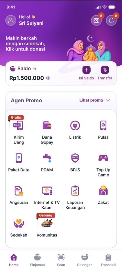 Entry
Taps Isi Saldo on Home
-
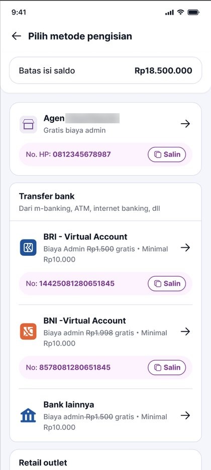 Everyone
Chooses a top-up method
-
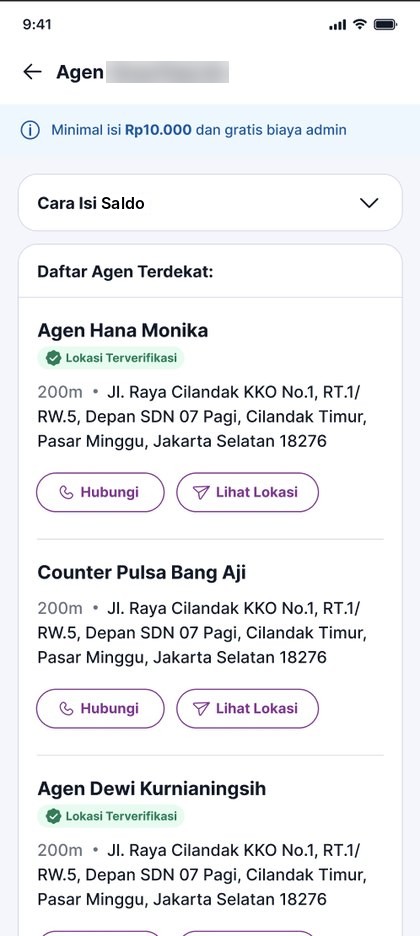 Most
Opens the nearby agents list
-
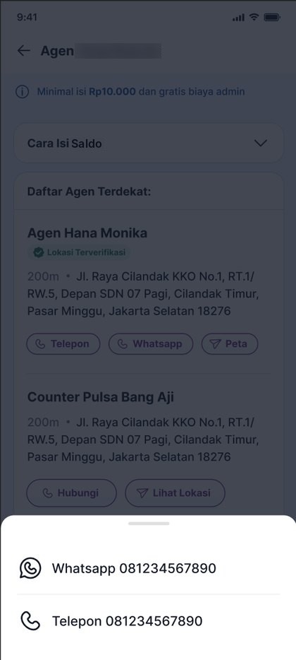 Few
Taps Hubungi or Lihat Lokasi Optional
-
Outside the appVery few
Goes to the agent and pays in cash. The agent tops up the borrower's in-app wallet.
Top-up completed. A big drop from the agent list.
The question
Most borrowers opened the nearby agents list, so they were willing to use an agent. Very few topped up. What stopped the rest?
What I checked first
The team used taps on Hubungi and Lihat Lokasi as the sign that the agent page worked. I compared two groups to see whether tapping actually led to a top-up.
7 in 100 topped up
7 in 100 topped up
What I suspected in the current design
Borrowers already know their channel
Borrowers come to the top-up page already knowing which channel they'll use, only to see the instructions. Once they know how, they don't come back to this page.
Agent info is too text-heavy
Nearby agent cards were mostly text, so borrowers didn't want to read them. They may also not understand what the "Lokasi Terverifikasi" label means.
Nothing to trust
No store photos to prove the shop exists, so borrowers hesitate to visit.
Dead ends
If no agent was within 25 km, the page only said there was no nearby agent. It didn't explain why or what to do next, so borrowers were left hanging.
Research
To learn what happens off-screen, we tested a revamped prototype of the top-up page and agent list with borrowers. I designed the prototype, set the research objectives and questions, and went into the field to run the interviews with our Senior Product Researcher.
Participants were picked by how familiar they were with the company's products, how comfortable they were with technology, and where they lived.
What we learned
Mobile banking and cash borrowers want different things
For borrowers with mobile banking, a free admin fee at our agents doesn't change their choice, because convenience matters more. Someone who banks with a specific bank looks for that bank's option. For borrowers who pay in cash, a free admin fee and knowing the payment went through come first. In many borrower groups, one member already tops up for the whole group through mobile banking.
Borrowers only pay through people they trust
Family, group members, or a nearby agent or counter that others recommended. When borrowers do change how they pay, they follow a field officer or another member.
The top-up page is a one-time visit
Borrowers open it when they top up for the first time or want to change method. After that, they rarely come back.
People look for logos, not words
Many borrowers are older and find small text hard to read, so they scan for a logo they know. Our agent network was the least recognized option. If they couldn't spot a logo, they assumed the option didn't exist.
Photos and travel time decide the agent
Borrowers assumed the first three agents were the closest, then checked the street, the shop photo and the map. They described distance as "5 menit naik motor", not in meters. The "verified" label confused them; photos and transaction counts built trust.
What this explains
Most of my hypotheses held up. Borrowers arrived with a payment method in mind, agent cards were too text-heavy and the verified label was unclear, borrowers needed proof before visiting, and empty results were dead ends. What I hadn't expected was how much trust comes from people: family, group members and field officers decide where borrowers pay, and the top-up page is visited only once.
So the proposal doesn't try to convince everyone to switch. It focuses on borrowers who pay in cash: it helps them find an agent they can trust, quickly, and keeps the page focused on the agent list.
Design proposal
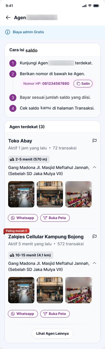
Shown from the borrower's side. Approved by the product and business teams, not released yet.
Goal: help borrowers quickly find an agent they can reach, and feel safe enough to visit.
Steps open on the first visit only
Expanded the first time, collapsed after, so the agent list stays in focus.
Surface nearby agents
Shows how many agents are nearby. Only active, qualified agents appear.
Bigger activity and distance
Easier to see. Distance shows travel time, like "2-5 menit".
Photos, not a verified badge
"Verified" confused borrowers. Photos and transaction counts built trust.
Labels for top agents
"Paling murah" or "Rekomendasi" for top-tier agents.
 12467358
Report a problem
Flag a wrong address, photo or phone number. An AP checks it in person.
Landmark with the address
A nearby landmark helps, and long addresses collapse.
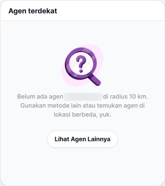
From 25 km to 10 km, no dead end
Agents 25 km away aren't useful, so the radius is now 10 km. If none are that close, borrowers can search another area.
- Active in the last 3 months, with any top-up, transfer or PPOB transaction
- A minimum amount of cash-in over the past week
- Location submitted by the agent
- Kiosk or intermediary agent
- Not a company employee
Goal: show that trusted agents exist, even when none are within 10 km, and keep borrowers moving.
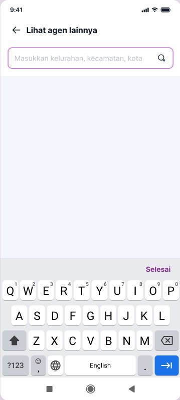
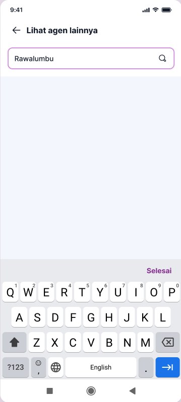
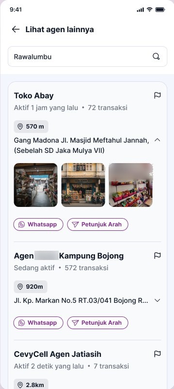
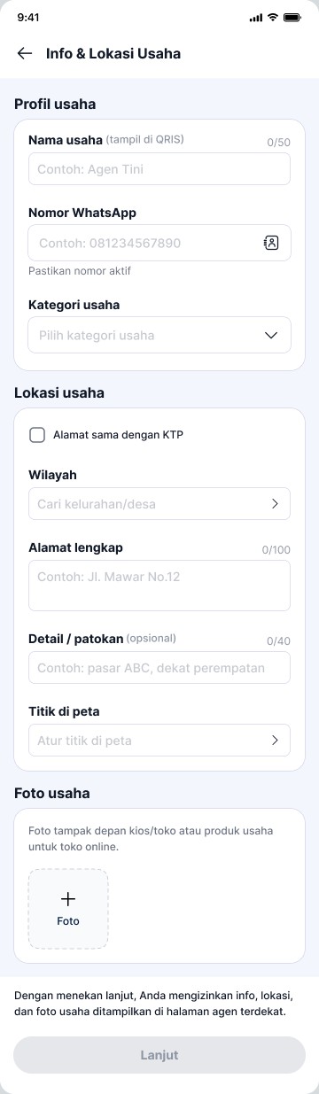
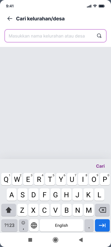
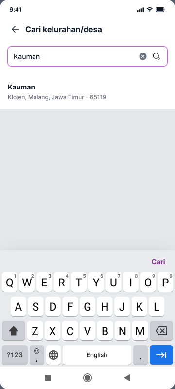
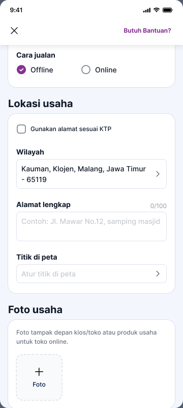
Trade-off I first considered listing kelurahan based on the user's location. That needed geo-tagging, which adds cost and a dependency. A search field was cheaper to build, works without location data, and is faster for people who already know their area.
Goal: keep agent data accurate, with borrowers and APs working together.
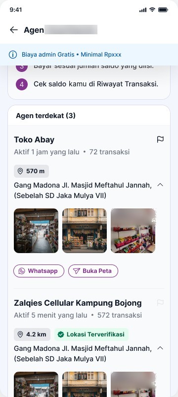 12
Flag to report
Each agent card has a flag in the corner.
Disabled after reporting
Once a borrower reports an agent, the flag turns grey. This prevents duplicate reports and abuse.
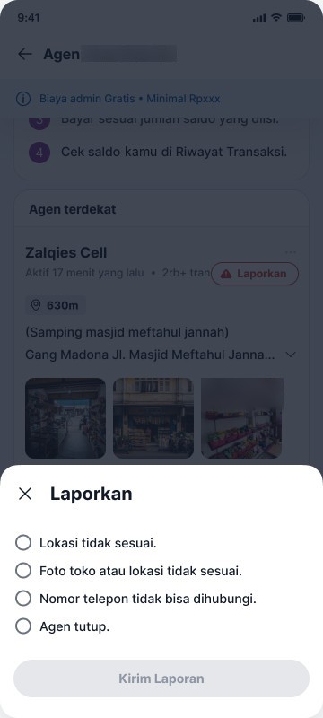 34
Four clear reasons
Wrong location or photo, a phone that doesn't answer, or a closed shop.
Send only with a reason
Kirim Laporan stays inactive until a reason is selected.
- Checked in personReports are collected first. An AP then visits the location to check and fix the data.
Goal: make distance easy to understand for borrowers.
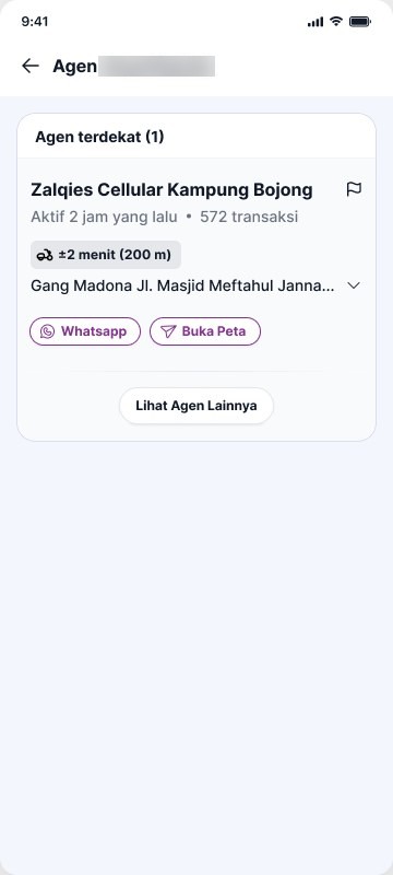
In testing, some borrowers read 200 m as farther than 1.2 km, because 200 is the bigger number. They describe distance in time instead, like "5 menit naik motor".
Bucketing. We don't calculate exact travel time. Each distance is grouped into a time range that borrowers can understand at a glance, and the distance stays in brackets.
| Under 500 m | about 2 min |
| 500 m to 1 km | 2 to 5 min |
| 1 to 3 km | 5 to 10 min |
| 3 to 5 km | 10 to 15 min |
| Over 5 km | more than 15 min |
Related work by other designers
The same research also shaped two other pages, designed by teammates.
Top-up page
Group by how people pay
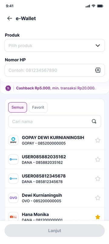
Uang Tunai, E-Wallet and Bank Transfer, so borrowers start from the money they have in hand.
Make logos easy to spot
Most-used channels above the fold, no banners over logos, and larger text. Search stays for younger users.
Repayment page
Offer the agent where repayment happens
For borrowers, finding an agent makes more sense on the installment page, where their repayment journey starts. The page offers paying through a nearby agent as an alternative payment method, with a way to find one.
What this shows
Questioning a metric before designing for it, going to the field to see what analytics can't, and turning those findings into design decisions for users with limited digital experience.